Posted by Jimmy Maher
https://www.filfre.net/2025/12/mr-roberts-goes-to-hollywood-part-2-the-producer/
https://www.filfre.net/?p=6569

With the Wing Commander movie having gone down in flames, there was nothing left for Chris Roberts and the rest of Digital Anvil to do but go back to making games. This undoubtedly pleased Microsoft, which had been waiting for some return on its generous investment in what it had thought was a new games studio for more than two years now. Yet Microsoft must have been considerably less pleased by the actual states of the game projects being undertaken by Digital Anvil. For they rather belied Roberts’s repeated assurances that doing the special effects for the movie wouldn’t affect the games at all. Of the five game projects that had been begun before the movies came calling, Robert Rodriguez’s Tribe had ended with his departure and Highway Knight had also been quietly abandoned. Two of the other projects — the real-time-strategy game Conquest and the crazily ambitious alternative-life-in-a-box Freelancer — were spinning their wheels with no firm timetable.
That did at least leave Starlancer to stand out as a rare example of good sense. At the height of his brother’s movie mania, Erin Roberts had flown to Britain, to place his Starlancer design documents in the hands of a new outfit called Warthog, located in the Robertses’ old hometown of Manchester. The first tangible product to result from Microsoft’s investment in Digital Anvil would thus come from a sub-contractor rather than from the studio itself.

Starlancer shipped in April of 2000, whereupon it became clear that, while Warthog had done a competent job with it, they hadn’t been able to make it feel fresh or exciting. “An interest-killing combination of ennui and déjà vu snakes through the whole endeavor,” wrote Computer Gaming World. In terms of presentation, it most resembled a higher-resolution version of Wing Commander II, the last game in the series before digitized human actors entered the picture. It too made do with straightforward mission briefings and the occasional computer-generated cutscene. By no means ought this to have been an automatically bad thing. Yet Starlancer lacked the spark that might have let it challenge the previous year’s Freespace 2 for the title of the 1990s space sim’s crowning glory. It sold like the afterthought it felt like.
In the meantime, Chris Roberts had picked up the pieces after the disappointment of the Wing Commander movie’s reception and unleashed his prodigious capacity for enthusiasm upon the Freelancer project. As he told gaming magazines and websites throughout 1999 and 2000, his goal was to create a “detailed, dynamic, living world” — or rather a galaxy, in which you could travel from planet to planet in your customized spaceship, doing just about anything you could imagine.
Freelancer is way beyond anything I’ve done in the Wing Commander universe. It’s going to be a fully functioning, living, breathing universe with a whole ecosystem. You can see the promise in something like Privateer, but this is geometrically [exponentially?] beyond that game. It’s like building a city. [?] Compared to Privateer, the scope, the dynamic universe — it’s all 3D — is much more interesting. There’s much more intrigue the player can get involved in. Everything’s rules-based versus scripted. Commerce happens, trade happens, and piracy happens because of what’s going on in the game universe and not because of scripted events.
Freelancer could be played alone, but would well and truly come alive only when played online, as described by Computer Gaming World:
Freelancer’s multiplayer game will be a massively-multiplayer universe where thousands of players will be able to fly around and interact with each other in a variety of capacities. Digital Anvil envisions a dynamic, socially-oriented game that features the single-player game’s politics and clans as a backdrop. This multiplayer game will also permit you to ally with one of the main houses in the game, or go it alone.
Perhaps the coolest potential feature is the ability to own your own base…
Any of you reading this article who have been following the more recent career of Chris Roberts will readily recognize the themes here. Roberts is not a designer with a huge number of grand conceptual ideas, but once he has one he likes, he holds onto it like a dog does a bone.
Alas, by the summer of 2000 Microsoft was finally running out of patience. Seeing Digital Anvil’s lack of concrete progress toward finishing Freelancer as their fourth anniversary as a studio approached, the mega-corp was becoming restless. Even Erin Roberts seemed to be losing patience with his brother. With Chris’s acquiescence, he set up his own studio in Austin, called Fever Pitch Studios, to finish Digital Anvil’s long back-burnered real-time-strategy game Conquest. It would emerge in August of 2001 under the name of Conquest: Frontier Wars, the second Digital Anvil game that had had to leave its place of birth in order to come to fruition. It would prove no more successful than Starlancer, drowning in a sea of similar games.
Well before then, Microsoft reluctantly concluded that Chris Roberts, the whole reason it had invested so heavily in Digital Anvil in the first place, was the primary reason that the studio couldn’t finish a single game on its own. Still not wanting to raise a scandal the year before the Xbox launched to signal an even deeper commitment to games, it “offered” to buy Roberts out, a transaction which would give it a majority stake in the studio. On December 5, 2000, the press release went out: “Microsoft has reached a preliminary agreement to buy Digital Anvil. The acquisition will strengthen our commitment to producing top-quality PC and Xbox titles.” Roberts was to be given the face-saving ongoing role of “creative consultant” on Freelancer, but the reality was that he had been fired from his own company for his inability to keep to a schedule and hold to a plan. His time at Digital Anvil had resulted in one commercially failed and critically panned movie, plus two games that had had to be sub-contracted out to other developers in order to get them finished; both of them as well had been or would become commercial failures. Yet Chris Roberts walked away from Digital Anvil much wealthier than when he had gone in. He told the press that he would “take some time off to kind of rethink what I want to do in the interactive-entertainment field.” When he was done thinking, he would decide to go back to focusing on movies instead of games.
In the meantime, Microsoft installed a new management team down in Austin, with orders to sort through the unfocused sprawl that Freelancer had become and find out if there was a game in there that was worth saving. Perhaps surprisingly, they decided that there was, and turned the project over to a producer named Phil Wattenberger and a lead designer named Jörg Neumann, both Origin Systems alumni who had worked on the old Wing Commander games. At Microsoft’s behest, they steered Freelancer in a slightly more casual direction, making the player’s ship easily — in fact, optimally — controllable using a mouse alone. The mouse-driven approach had actually originated during Roberts’s tenure, but there it had been tied to a customizable and upgradable “Neuronet,” an onboard artificial intelligence that was supposed to let you vibe-sim your way to glory. That got jettisoned, as did many other similarly unwieldy complications. The massively-multiplayer living galaxy, for example, became a single-player or locally multiplayer one that wasn’t quite so living as once envisioned.

When it finally shipped in March of 2003, Freelancer garnered unexpectedly strong reviews; Computer Gaming World called it “the best Chris Roberts space sim Chris Roberts didn’t actually make.” But it wasn’t rewarded commensurately in the marketplace. Even with its newfound accessibility, it was hard for it to shake the odor of an anachronism of the previous decade among gamers in general; meanwhile the dwindling number of TIE Fighter and Freespace enthusiasts had a tendency to reject it for being irredeemably dumbed-down. Instead of marking the beginning of a new era for the space sim, it went down in history as a belated coda: the very last space sim to be put out by a major publisher with real promotional efforts and the hope — unrealized in this case — of relatively high sales behind it.
As for Digital Anvil: it was shut down by Microsoft once and for all in November of 2005, after completing just one more game, a painfully unoriginal Xbox shoot-em-up called Brute Force. Two games finished in almost nine years, neither of them strong sellers; the most remarkable thing about Digital Anvil is that Microsoft allowed it to continue for as long as it did.
By the time his games studio shuffled off this mortal coil, Chris Roberts had been living in Hollywood for a number of years. And he had found a way to do pretty well for himself there, albeit in a role that he had never anticipated going in.

The decade that Chris Roberts spent in Hollywood is undoubtedly the least understood period of his career today, among both his detractors and his partisans. It is no secret why: documentation of his activities during the decade in question is far thinner on the ground than during any other time. Roberts arrived in Hollywood as just another semi-anonymous striver, not as the “game god” who had given the world Wing Commander. No one in Tinsel Town was lining up to interview him, and no one in the press paid all that much attention to what he got up to. Still, we can piece together a picture of his trajectory in which we can have reasonable confidence, even if some of the details remain hazy.
Roberts moved to Hollywood in the spring of 2001 with his windfall from the Digital Anvil buyout burning a hole in his pocket. Notwithstanding the fiasco that had been Wing Commander: The Movie, he still harbored serious ambitions of becoming a director, probably assuming that his ability to finance at least part of the budget of any film he was placed in charge of would give him a leg up. He even brought a preliminary script to show around town. It was called The American Knight, being a cinematic reinterpretation of another computer game: in this case, Origin Systems’s 1995 game Wings of Glory, which was itself yet another variation on the Wing Commander theme, dealing with the life of a World War I fighter ace in the air and on the ground. In an even more marked triumph of hope over experience, Roberts also nursed a dream of making a live-action Wing Commander television series. He founded a production company of his own, called Point of No Return Films, to forward both of these agendas. January of 2002 found Point of No Return at the Sundance Film Festival; according to E! Online, they “threw an after-hours shindig that attracted 250 revelers, with Treach and De La Soul among them.” It really did help Roberts’s cause to have some money to splash around.
But Roberts soon found that the people he met in Hollywood knew Wing Commander, if they knew it at all, only as a misbegotten flop of a film. And they weren’t much more interested in his World War I movie. They were, on the other hand, always ready to talk backroom business with someone who had some number of millions in his pocket, as Roberts did. What followed was a gradual but inexorable pivot away from being a filmmaker and toward being a film enabler, one of those who secured the cash that the creative types needed to do their thing. A watershed was reached in March of 2002, when Point of No Return Films morphed into Ascendant Pictures, whose focus was to be “improving film value in foreign territories (presales), attracting top talent and film projects, and generating equity investment in films.” It wasn’t the romantic life of an auteur, but it did show that Chris Roberts was learning to talk the talk of back-office Hollywood, aided and abetted by a network of more experienced hands that he was assembling around him. Among them was a German immigrant named Ortwin Freyermuth, who would become the most important and enduring business partner of Roberts’s post-Origin career.
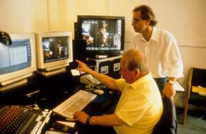
Ortwin Freyermuth, right, discusses a director’s cut of Das Boot with the film’s original editor Hannes Nikel circa 1997. Like Chris Roberts, Freyermuth really does love movies.
Freyermuth was renowned in the proverbial smoke-filled rooms of Hollywood for having pioneered an incredibly useful funding model for American films. It hinged on a peculiarity of German tax law that had been intended to encourage local film-making but instead wound up becoming a demonstration of the law of unintended consequences, played out on an international stage. The original rule, as implemented by the German Ministry of Finance in the 1970s, stated that any money that a German resident invested into a film production could be immediately deducted from his or her taxable income as if it was a total loss. It was hoped that this would encourage more well-heeled Germans to invest in homegrown movies, in order to combat the creeping mono-culture of Hollywood and ensure that Germans would have films to see that dealt with contemporary life in their own country. In time, this well-meaning measure would produce just the opposite result.
Enter Ortwin Freyermuth, a lawyer who enrolled at the University of California, Los Angeles, in the mid-1980s to study international copyright law. When he stumbled across the German law I’ve just described in the course of his studies, he noted with no small excitement what it didn’t say: that the films that were deemed eligible for the tax deduction had to be German films. He arranged to fund the 1990 movie The Neverending Story II almost exclusively with German money. This first experiment in the field was not so egregious compared to what would come later, given that the movie was also shot in Germany, albeit using mostly American actors. Then again, it was only a proof of concept. Freyermuth co-founded Capella Films thereafter to make German financing a veritable way of life for Hollywood. “In the best Hollywood tradition,” wrote Variety in 1994, “the company is rife with layers of relationships, both contractual and personal, here and abroad, such that an organizational chart, if one existed, would have more lines and intersections than fractal math.” Such byzantine structures, which had a way of obscuring realities upon which people might otherwise look askance, were standard operating procedure for Freyermuth.
The Freyermuth model spread throughout Hollywood as the 1990s wore on. It seemed like a win-win, both to those in California and to the Germans who were suddenly funding so many of their movies. In some cases, you could just borrow the money you wanted to invest, use your investment to reduce your taxable income dramatically, then pay off the loan from the returns a year or two later. And there was nothing keeping you from doing this over and over, year after year. Large private-equity funds emerged in Germany, pooling the contributions of hundreds of shareholders to invest them in movies, 80 percent of them made outside of the country. These Medienfonds became as ordinary as any other form of financial planning for Herr und Frau Deutschland. They were great for people on the verge of retirement: make an investment just before retiring, then enjoy the return afterward when your tax rate was lower. They were great for spreading out and reducing the tax liability that accompanied a major windfall, great for parents wishing to move money into the hands of their grown children without getting hit by high inheritance taxes. For Hollywood, meanwhile, they turned into a money spigot like no other. Insiders took to calling it “stupid German money,” because the people behind the spigot tended to take it in stride even if the films they were investing in never turned much of a profit. The real point of the investment was the tax relief; any additional profits that emerged were just gravy. The highest tax bracket in Germany at the time was about 51.5 percent. If you were in this tax bracket, then as long as you got at least half of your money back, you came out ahead.
The sheer ubiquity of these media funds placed the German people’s elected representatives in Berlin in a delicate situation; a growing number of their own constituents were benefiting from the current state of the law. Nevertheless, in 1999 the Ministry of Finance made an attempt to stop the madness. It revised the rules to bring them into closer alignment with those that governed other, superficially similar European incentive schemes: to qualify, a film now had to either be made in Germany at least partially or have a German copyright owner. (A law of this sort in Luxembourg was the reason that the Wing Commander movie had been shot in that country.) But stupid German money was now too entrenched as a modus operandi for people on either side of the Atlantic to walk away from it without putting up a fight. Artful dodgers like Ortwin Freyermuth realized that they could sell the copyright to a Hollywood production to a German media fund, whilst inserting into the sales contract a right to buy it back at a future date for an agreed-upon price. Far from being hobbled by the change in law, they realized that they could use it to charge a premium for the tax relief they were providing to the citizens of Germany. For example, the Germans paid $94 million to Paramount Pictures for the copyright to the 2001 videogame adaptation Lara Croft: Tomb Raider. When they sold it back, the Germans were paid only $83.8 million. The tax benefits were so great that it was still worth it. By now, half of all the foreign money pouring into Hollywood was coming from the single country of Germany: $1.1 billion in 2004 alone.
Despite their ongoing popularity among the well-heeled classes, the media funds became more and more controversial in Germany as the young millennium wore on. Germany was, it was more and more loudly complained, effectively subsidizing Hollywood using money that ought to have been going to roads, schools, hospitals, and defense. Stefan Arndt, the producer of the rather wonderful German movies Run Lola Run and Good Bye Lenin!, noted that he had had to go outside his homeland to finance them because his fellow citizens all had their gazes fixed so firmly on Hollywood. “It’s crazy,” he said. “Every other country in the world ties strings to its film subsidies.” Even a group of hardcore Tolkien fans sleeping in line the night of the premiere of The Return of the King, the third film in Peter Jackson’s disproportionately German-funded Lord of the Rings trilogy, thought the situation a little bit absurd when they were told about it: “I don’t think that’s good, because I think that the three films carry themselves, that they put in enough money, that it doesn’t necessarily have to be financed with taxes.”
Whether we wish to see him as a devil tempting a young Faust named Chris Roberts, or just as a savvy man of business who found a mentee he deemed well worth his time, Ortwin Freyermuth showed our once and future game developer how this particular game was played. In April of 2004, Roberts was credited onscreen for the first time in a finished wide-release film as an executive producer. As if to underscore the transition he had made from creator to enabler, it was not a terribly Chris Roberts sort of movie. The Punisher was based on a Marvel Comics character, but it was no family-friendly superhero movie either. It was a grim, dark, and brutally violent revenge fantasy that made Dirty Harry look cute and cuddly. “At the end,” wrote the late great Roger Ebert in his review, “we feel battered down and depressed, emotions we probably don’t seek from comic-book heroes.” Whatever else you can say about Wing Commander, it does care deeply about the nobler human virtues which The Punisher submerges under fountains of blood, even if Chris Roberts is often irredeemably clumsy at presenting them.

Although The Punisher may have had a B-movie attitude, it wasn’t a B-movie, any more than Wing Commander had been. It was made for a budget of $33 million, with a cast that included John Travolta. (Admittedly, he sleepwalks through his performance as if he can barely be bothered to learn his lines, but one can’t have everything.) However joyless fuddy-duddies like yours truly and Roger Ebert may find movies like this, there was and is a market for them. The Punisher earned $20 million more than it had cost to make at the box office even before the long tail of cable-television showings and home-video rentals was factored into the equation.
Chris Roberts was off and running as a backstage Hollywood player. At the Sundance Film Festival in January of 2005, his name could be seen alongside those of George Clooney and Steven Soderbergh among the producer credits for The Jacket, an arty but flawed science-fiction film starring Adrien Brody, Kiera Knightley, Kris Kristofferson, and the future Agent 007 Daniel Craig, with a soundtrack by Brian Eno. Again, these names are not the stuff of B-movies.
After The Jacket, Ascendant Pictures graduated from being an ancillary source of funding to becoming one of the primary production houses behind four reasonably high-profile independent features during 2005 and 2006. None of Lord of War, The Big White, Ask the Dust, or Lucky Number Slevin has gone down in film history as a deathless classic. Yet all of them could boast of A-list actors: Nicholas Cage, Jared Leto, Ethan Hawke, Robin Williams, Holly Hunter, Woody Harrelson, Colin Farrell, Selma Hayek, Donald Sutherland, Morgan Freeman, Ben Kingsley, and Bruce Willis can all be found amongst their casts.
A you have probably guessed, all of these films were funded primarily with German money. The aggregate return on them was middling at best. Lord of War and Lucky Number Slevin did pretty well; The Big White and Ask the Dust flopped miserably. As already noted, though, the fact that most of their investors were more concerned about the tax benefits than a more conventional return on investment made this less of an issue than it might otherwise have been. Then, too, like mutual funds on the conventional stock market, the German media funds put money into many movies in order to avoid a single point of failure. A film that became an unexpected hit could easily offset two or three duds.
Chris Roberts had arrived in the Hollywood inner circle — perhaps still the outer edge of the inner circle, but still. He had come a long way from that nerdy bedroom coder who had bumped into an artist from Origin Systems one day in an Austin games shop. Now he was living in a luxury condo in the Hollywood Hills, with one live-in girlfriend and a former one stalking him. (Oddly, it would be the latter whom he would wind up marrying.) I’ve been pretty hard on Roberts in these articles, and I’m afraid I’m going to have to be so again — harder than ever, in fact — before we’re finished. But two things he most definitely is not are stupid or lazy. I wrote at the outset of this pair of articles that few people have ever stretched so thin a thread of creative talent as far as he has. Let me amend that bit of snark now by acknowledging that he could never have done so if he wasn’t smart and driven in a very different sort of way. And let me make it crystal clear as well that nothing I’ve written about Roberts’s tenure in Hollywood so far should necessarily lead us to criticize him in any but the most tempered of ways. In exploiting a loophole in German tax law for all it was worth, he wasn’t doing anything that tons of others — a full-fledged cottage industry worth of them, on both sides of the Atlantic — weren’t also doing. But there’s more to the story in his case. Chris Roberts and Ortwin Freyermuth were actually near the center of one of the biggest financial scandals in modern German history, where dubious ethics crossed over into outright fraud.
Hollywood accounting is never simple. In that spirit, Ascendant Pictures spun off another company not long after its own founding. The wholly-owned subsidiary Rising Star Pictures was created to “closely cooperate with VIP Medienfonds Film and Entertainment”; this was the largest of all the German media funds, which collected almost half a billion Euros every year from its shareholders. Rising Star’s purpose was to be VIP’s anointed agent on the left side of the Atlantic, directing that fire hose of stupid German money around Hollywood. This meant the films of Ascendant, yes, but also those of others, to which Rising Star presumably charged a brokering fee. The final incarnation of Ascendant’s website, which is for some reason still extant, claims that Rising Star was involved in the funding of fourteen films in 2003 alone. A version of their site from March of 2005, accessible today via the Internet Archive’s Wayback Machine, heavily stresses the relationship with VIP, calling Rising Star the latter’s “primary placement agent.” This was a big, big deal, given the sheer quantity of money that VIP was taking in and paying out; more than $250 million came into Rising Star from VIP during 2003. The speed and scale of Chris Roberts’s rise in Hollywood becomes even more impressive when figures like these are taken into consideration.

Andreas Schmid
Unfortunately, Andreas Schmid, the head of VIP, was arrested for tax fraud in Cologne in October of 2005. It seemed that he had not been putting most of the money he collected into movies with even ostensibly German owners, as the law required. At regular intervals, Schmid dutifully gave his shareholders a list of films into which he claimed to have invested their contributions. In actuality, however, VIP used only 20 percent of their money for its advertised purpose of funding movies. Schmid deposited the remaining 80 percent into his bank, either parking it there to earn long-term interest or sending it elsewhere from there, to places where he thought he could get a higher rate of return. He then sent fake earnings reports to his shareholders. By defrauding both the government and his clients in this way, he could make a lot of money for himself and his partners in crime. There is reason to believe that Chris Roberts and Ortwin Freyermuth were among said partners, working the scam with him through Rising Star. I’ll return to that subject shortly.
For now, though, know that Schmid may have gotten so greedy because he knew the jig was soon to be up. Rumors were swirling in both Hollywood and Berlin throughout 2005 that the German Ministry of Finance had just about had enough of watching its tax money fly out of the country. The VIP Media scandal proved the last straw, if one was needed. In November of 2005, just one month after Schmid’s arrest, it was announced that blanket tax write-offs for film investments of any stripe were a thing of the past. Going forward, Hollywood would have to find another golden goose.
Even if they weren’t in on the fix, so to speak, the arrest of Schmid and the elimination of their primary funding mechanism could only have had a deleterious effect on Ascendant Pictures. Just when they had seemed to be hitting the big time, the ground had shifted beneath their feet. Those films that were already paid for by Germans could still be made, but there would be no more like them. The last Ascendant movie from the salad days to emerge from the pipeline was Outlander, their most expensive one ever and arguably also their worst one yet; not released until 2008 due to a whole host of difficulties getting it done, it managed to lose $40 million on a $47 million budget.
Deprived of the golden eggs, Ascendant blundered from lowlight to lowlight. They had to renege on a promise to Kevin Costner to line up the financing for a movie called Taming Ben Taylor, about “a grouchy, divorced man who refuses to sell his failing vineyard to the golf course next door.” Costner, who had been so excited about the movie that he had co-written the screenplay himself, sued Ascendant for $8 million for breach of contract; the case was settled in March of 2008 under undisclosed terms.

The first and only film that Ascendant helped to fund without German money only served to advertise how far down they had come in the world. Keeping with the golf theme, the low-rent Caddyshack ripoff Who’s Your Caddy?, which made Wing Commander look like Hamlet, was released in 2007 and failed to earn back its $7 million budget. It’s best remembered today for an anecdotal report that Bill Clinton loved it. By this point, Ascendant was little more than Chris Roberts and Ortwin Freyermuth; everyone else had jumped ship. (Freyermuth seems genuinely fond of Roberts. He has stuck with him through thick and thin.) The company would nominally continue to exist for another three years, but would shepherd no more movies to completion during that time. Its final notices in the Hollywood trade press were in association with Black Water Transit, a locus of chaos, conflict, and dysfunction that culminated in a film so incoherent that it would never be released.
Over in Germany, Andreas Schmid was convicted and sentenced to six years in prison in November of 2007. Yet the fallout from the VIP scandal was still ongoing. Shortly after his conviction in criminal court, 250 former shareholders in his fund, from whom the German government was aggressively demanding the taxes they ought to have paid earlier, launched a civil lawsuit against Schmid and the UniCredit Bank of Munich, where he had been depositing the money he claimed was being used to fund movies. The case hinged on a single deceptively simple question: had the information that Schmid sent to his shareholders in the reports issued by his fund been knowingly falsified? Some of the documents from these court proceedings, which would be decided in favor of the plaintiffs on December 30, 2011, can be accessed online at the German Ministry of Justice. I’ve spent some time going over them in the hope of learning more about the role played by Roberts and Freyermuth.
It’s been a challenge because the documents in question are not the trial transcripts, transcripts of witness interviews, nor the detailed defense and prosecution briefs one might wish to have. They are rather strictly procedural documents, used by the court to schedule its sessions, outline the arguments being made before it, and handle the other logistics of the trial. Nonetheless, they contain some tantalizing tidbits that point more in the direction of Roberts and Freyermuth as co-conspirators with Schmid than as his innocent victims. I’ll tell you now what I’ve been able to glean from them as a non-lawyer and non-accountant. I’ve also made them available for download from this site, for any readers who might happen to have a more nuanced command of the German language and German law than I do.
The claimants in the lawsuit show great interest in Ascendant’s daughter company Rising Star, which they believe had no legitimate reason for existing at all, a judgment which is confirmed by the court in a preliminary draft of the final ruling. A document dated June 27, 2008, contains the startling charge that Rising Star “never produced films, but were merely an intermediary layer used for concealment,” citing emails written by Chris Roberts and Ortwin Freyermuth to Andreas Schmid between 2003 and 2005 that have been submitted into evidence. (Sadly, they are not included among these papers.) Another document, dated May 15, 2009, calls Rising Star “an artificially imposed layer.” The final judgment concludes that Rising Star was an essential conduit of the fraud. What with Rising Star being the “the primary placement agency for VIP,” as was acknowledged on the Ascendant website, all of the money passed through it. But instead of putting the entirety of the money into movies, it only used 20 percent of it for that purpose, funneling the rest of it back to the UniCredit Bank of Munich, Andreas Schmid’s co-defendant in the shareholder lawsuit. Even the 20 percent that stayed in Hollywood was placed with other production companies that took over the responsibility of overseeing the actual movies. Rising Star, in other words, was nothing but a shell company, a false front for getting the money from the investment fund into Schmid’s bank.
Both Roberts and Freyermuth were interviewed at least once, presumably in the United States, by investigators from the Munich Public Prosecutor’s Office; this must have been done in the run-up to Schmid’s earlier, criminal trial. They are described here as witnesses rather than defendants, yet the facts from their testimony that are cited here leave one wondering why that should be the case. From a document dated May 15, 2009: “The structure provided by VIP was a ‘pro forma transaction,’ solely intended to achieve a certain tax advantage. This was also explained by witness Freyermuth.” The claimants cite the testimony of Roberts and Freyermuth as evidence that “the fund managers therefore instructed their American partners to submit inflated estimates.” Likewise, it is written that Roberts and Freyermuth confessed to a falsified “profit distribution for the film Perfume: The Story of a Murderer, which, according to the fund’s information, was 45 percent produced by VIP. In reality, the profit distribution did not correspond to the alleged 45-percent co-production share; it was significantly less favorable.” Even with the most open of minds, it is very hard to read statements like this and conclude that Chris Roberts and Ortwin Freyermuth were anything other than active, willing co-conspirators in a large-scale, concerted fraud perpetrated on German investors and ordinary taxpayers.
In a document dated May 17, 2010, it is stated that Freyermuth and Roberts are being summoned to appear as witnesses before this court, on the morning and afternoon respectively of July 16, 2010. But a report dated July 8, 2010, states that “the hearing scheduled for July 16, 2010, is cancelled after witness Freyermuth informed the court that he could not appear on such short notice, and the summons for witness Chris Roberts was returned to the court as undeliverable.” On August 3, 2010, the court states that they will be ordered to appear again, this time on September 20, 2010, saying that Freyermuth will be told to inform Roberts, who apparently still cannot be reached, about the summons. However, the paper trail ends there. It seems most likely that the two never did come to Munich to answer questions before the court.
Assuming all of this really is as bad as it looks, the final question we are left with is why and how Roberts and Freyermuth escaped prosecution. This question I cannot even begin to answer, other than to say that international prosecutions for financial malfeasance are notoriously difficult to coordinate and carry off. Perhaps the German authorities decided they had the ringleader in Andreas Schmid, and that was good enough. Perhaps Roberts and Freyermuth were given immunity in return for their testimony about the mechanics of the fraud in the United States. Or maybe there were some extenuating circumstances of which I am not aware, hard as it is to imagine what they might be.
In July of 2010, Roberts and Freyermuth sold Ascendant Pictures and all of its intellectual property to a film studio, film school, film distributor, real-estate developer, venture-capital house, and children’s charity — never put all your eggs in one basket! — called Bigfoot, located in, of all places, the Philippines. Roberts had left Hollywood some weeks or months before this transaction was finalized; thus the undeliverable court summons from Germany, addressed to the old Ascendant office. I do not know whether or how much he and Freyermuth ended up profiting personally from the VIP Media affair when all was said and done. I can only say that he does not seem to have been a poor man when he moved back to Austin to think about his next steps in life.

Most of you probably know what Chris Roberts got up to after leaving Hollywood, but a brief precis may be in order by way of conclusion, given that it will be many years at best before we meet him again in these histories.
Man of good timing that he was, Roberts started looking for fresh opportunities just as the new Kickstarter crowd-funding platform was tempting dozens of figures from the old days of gaming to launch new projects. In 2012, he joined together with a number of his earlier business partners, from both Digital Anvil and Ascendant Pictures — Erin Roberts, Tony Zurovec, and Ortwin Freyermuth were all among them — to found Cloud Imperium Games and kick-start Star Citizen, the “virtual life in space” game that he had once thought Freelancer would become. Brilliantly executed from a promotional standpoint, it turned into the biggest Kickstarter project ever, raising hundreds of millions of dollars.
As of this writing, thirteen years later, Star Citizen is officially still in the early alpha stage of development, although it is actively played every day by tens of thousands of subscribers who are willing to pay for the privilege. A single-player variant called Squadron 42 — the Starlancer to Star Citizen’s Freelancer — was originally slated for release in 2014, and is thus now eleven years behind schedule. Cloud Imperium promises that it is coming soon. (If and when it finally does surface, it will include motion-captured footage, shot twelve years ago now, of Mark Hamill, Gillian Anderson, Andy Serkis, and Gary Oldman.)
Having long since exhausted its initial rounds of crowd-funding, Cloud Imperium now pays its bills largely through pay-to-win schemes involving in-game spaceships and other equipment, often exorbitantly priced; Ars Technica reported in January of 2024 that buying the full hangar of ships would set up you back a cool $48,000, almost enough to make you start looking around for the real spaceship in the deal. By any standard, the amount of money Cloud Imperium has brought in over the years is staggering. Assuming the whole thing doesn’t implode in the coming months, Star Citizen seems set to become the world’s first $1-billion videogame. While we wait, Wing Commander IV, the last game Chris Roberts actually finished, looks forward to its swift-approaching 30-year anniversary.
Naturally, all of this has made Cloud Imperium and Chris Roberts himself magnets for controversy. The loyal fans who continue to log on every day insist that the scale of what Star Citizen is trying to achieve is so enormous that the time and money being spent on it are unavoidable. Others accuse the game of being nothing but a giant scam, of a size and shameless audacity that would put a twinkle in even Andreas Schmid’s jaundiced eyes. Some of those who think the truth is most likely somewhere in between these extremes — a group that includes me — wonder if we should really be encouraging people to upload so much of their existence into a game in the first place. It seems to me that games that are meant to be enjoyed in the real world are healthier than those that set themselves up as a replacement for it.
Even if everything about Star Citizen is on the up-and-up, it’s difficult to avoid the conclusion that breathtaking incompetence has played as big a part as over-ambition in running up the budget and pushing out the timeline. I tend to suspect that some sort of spectacular collapse is more probable than a triumphant version 1.0 as the climax of the Star Citizen saga. But we shall see… we shall see. Either way, I have a feeling that Chris Roberts will emerge unscathed. Some guys just have all the luck, don’t they?
Did you enjoy this article? If so, please think about pitching in to help me make many more like it. You can pledge any amount you like.

Sources: Computer Gaming World of November 1999, August 2000, and May 2003; PC Gamer of November 2000; Los Angeles Times of August 14 2008; Der Spiegel of June 13 1993; Variety of February 24 1994 and November 13 2007; Los Angeles Daily News of March 5 2008; Billboard of April 19 2005, May 10 2005, September 20 2005, October 4 2005, and October 11 2005; Austin Business Journal of April 20 2001; Die Welt of December 6 2009; Deutsches Ärzteblatt of May 2 2003; New York Times of December 13 2004; Forbes of May 31 2019.
Online sources about games include a 2002 Wing Commander retrospective by the German website PC Player Forever; a 2000 GameSpot interview with Chris Roberts; Freelancer previews on ActionTrip and Games Domain; the old Freelancer News site; and the GameSpot review of Freelancer. Vintage reports of Digital Anvil’s acquisition by Microsoft can be found on GameSpot, IGN, Microsoft’s home page, and EuroGamer.
Online sources about movies include “Send in the Clowns (But Beware of Their Funny Money)” by Doug Richardson, Roger Ebert’s review of The Punisher, a profile of Ortwin Freyermuth at Alumniportal Deutschland, “How to Finance a Hollywood Blockbuster” and “Hollywood’s Big Loss” by Edward Jay Epstein at Slate, the current zombie version of Ascendant’s website and the more incriminating 2005 version, Bigfoot’s 2011-vintage website, E! Online’s report from the 2002 Sundance festival, “Medienfonds als ‘Stupid German Money'” by Dr. Matthias Kurp at Medienmaerkte.de, “Filmfonds für Reiche” at ansTageslicht.de, “Was sind Medienfonds?” at Investoren Beteiligung, and “Stupid German Money” by Günter Jagenburg at Deutschlandfunk. I made extensive use of the Wing Commander Combat Information Center, and especially its voluminous news archives that stretch all the way back to 1998.
As noted above, I’ve made the documents I found relating to Rising Star in the class-action lawsuit against Andreas Schmid available for local download. By all means, German speakers, dive in and tell me if you can find anything I’ve missed! I retrieved them from the official German Federal Gazette, or Bundesanzeiger.
My invaluable cheat sheet for this article, as for the last, was “The Chris Roberts Theory of Everything” by Nick Monroe from Gameranx.
But my superhero and secret weapon was our own stalwart commenter Busca, who used his far greater familiarity with the German Web and the German language to find most of the German-language sources shown above, and even provided some brief summaries of their content for orientation purposes. I owe him a huge debt of gratitude. Do note, however, that the buck stops with me as far as factual accuracy goes, and that all of the opinions and conclusions expressed in this article are strictly my own.
https://www.filfre.net/2025/12/mr-roberts-goes-to-hollywood-part-2-the-producer/
https://www.filfre.net/?p=6569
![[personal profile]](https://www.dreamwidth.org/img/silk/identity/user.png) sovay at 01:53am on 06/12/2025
sovay at 01:53am on 06/12/2025